 Guest post by Eugene Ward. Eugene is City People’s researcher and general wrangler of data. This tends to be spatial data on most projects — broadly, what’s in the place of interest and how does this influence our thinking? This blog post looks at three different pieces of open data inspiration for cultural planning.
What is open data?
When an organisation adopts an ‘open data’ policy, it means that their data sets are available to the public. Additionally—depending on the terms of the particular licence—this data can be used by those accessing it, for example for research projects or app development.
Open data platforms maintained by local, state and federal governments are an increasingly important part of the software development landscape. For example, if you’re in Sydney and you use a trip-planning app (like TripView), those developers have built their app’s functionality around retrieving real-time data from the Transport for NSW Open Data Hub. There are many similar examples of open data-driven transit apps in other cities around the world.
The licence is not the only aspect of an open data platform – generally, there’s an expectation that the data has been prepared and organised in a ‘ready to use’ way and is in a good state to analyse or integrate. This could be spreadsheet-style files, uploaded by the organisation at a regular interval, or an access point for a database or streamed data.

Photo by Jan Antonin Kolar on Unsplash
Is there open data for arts and culture?
In Australia the data captured by government, agencies and consultants specifically related to the arts has generally not been made available under open data terms. However, the ‘opening up’ of data is ongoing as part of digital transformation efforts in government and the situation could certainly change as these platforms expand.
Arts-related content on the various state open data portals is limited. South Australia’s Data.SA is perhaps the best resourced, with a dedicated ‘Arts, culture and history’ tag for browsing data sets.

Photo by EJ Strat on Unsplash
Making connections
While there might not be troves of explicitly arts-related data, there are still useful and pertinent data sources to be found through Australian government open data platforms.
In this article I’ll be looking at three examples of how Data.NSW’s list of licensed premises—a data set produced and maintained for regulatory purposes—can actually inspire some thinking around cultural data use cases.

Photo by Philippe Bout on Unsplash
Night-time economy insights: one data source, three case studies
Each month Data.NSW releases an up-to-date file tracking active liquor licences across the state. Currently, the series of available data goes back to March 2020 and the latest file is from March 2021. It’s a very feature-rich dataset with a range of location, operational, regulatory and other data attached to each property in New South Wales that holds a licence to sell or serve alcohol.
As an ongoing time series, there’s a lot that live use of the data can glean. When working on this article I accessed the February 2021 file. It was interesting to note that in the February data, of the 100 most recently approved (over a period spanning 73 days), more liquor licences commenced in the City of Liverpool Council local government area than in the City of Sydney (13 compared to 8). Ongoing monitoring of new licences for each LGA could be an interesting proxy for economic activity and growth—however, let’s get onto our cultural and more place-based use cases for this open data set…
Note: the below explorations detail data mapping ideas that would be interactive—however, since this article is just illustrative, we’re not going to deploy them live here on the website. The still images included hopefully convey the opportunities.
1. Finding family friendly pubs in your LGA
When moving to (or visiting) a neighbourhood, it might be nice to know which hotels have a bistro area that’s suitable for children.
Data steps:
- Since having a ‘minors area authorisation’ is a specific authorisation granted to venues, the data can be filtered for premises which have this phrase in their list of authorisations.
- Using a spatial data ‘shapefile’ from the ABS, you can retrieve a polygon of the LGA.
- For the LGA of interest, we can filter to include data from the Data.NSW licences that falls within the boundaries of the LGA, based on the coordinates in that dataset falling within the area encompassed by the polygon.
- Visualised in open source map software like folium or Leaflet, it might look like this (for North Sydney):
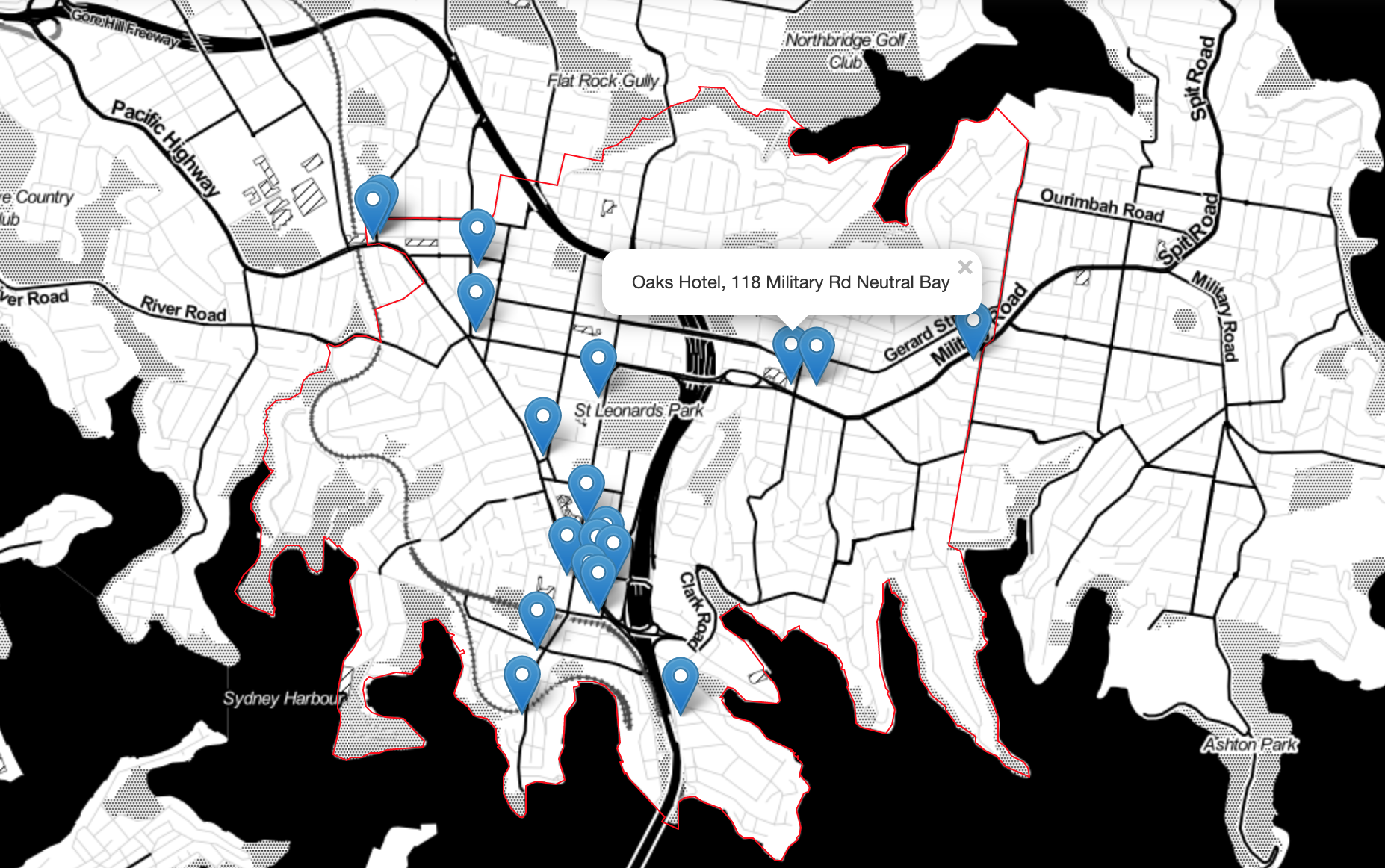
There’s obviously the greatest number of bistro options in the North Sydney CBD and generally, family friendly hotels are older pubs located on main roads.
Before moving onto our next use case, I want to explore another way of visualising the data in response to this scenario. It’s a somewhat esoteric method but I find it inspiring because it conveys both density and choice in the one map. It’s not without its quirks and caveats which I’ll note as well.
Voronoi diagrams take a set of points and divide the space they’re in into regions, so that each point is surrounded by a shape covering the area which is closest to that point. You can think of it as a catchment for the point. For example, looking at the family friendly pubs in North Sydney:
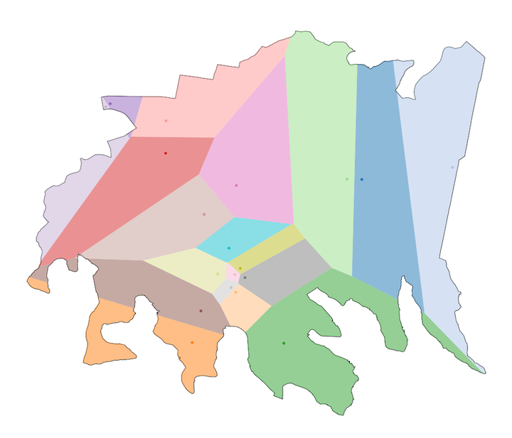
Immediately, you can probably see the issues with this analysis: not only does it not consider the network distance (i.e., travel via roads), it doesn’t appreciate the interference of the natural environment either. It’s truly ‘as the crow flies’ when it comes to the catchments it creates, resulting in some weird choices. Look at the orange region. At the edge of Berry Island Reserve? Obviously the Blues Point Hotel is your nearest pub, via two cross-harbour swims.
Voronoi regions need some rules and manipulation before they’d make robust catchments, however, they do work when we consider the landlocked zones entirely inside the LGA. Consider the below visualisation, which projects the Voronoi regions onto a folium street map:
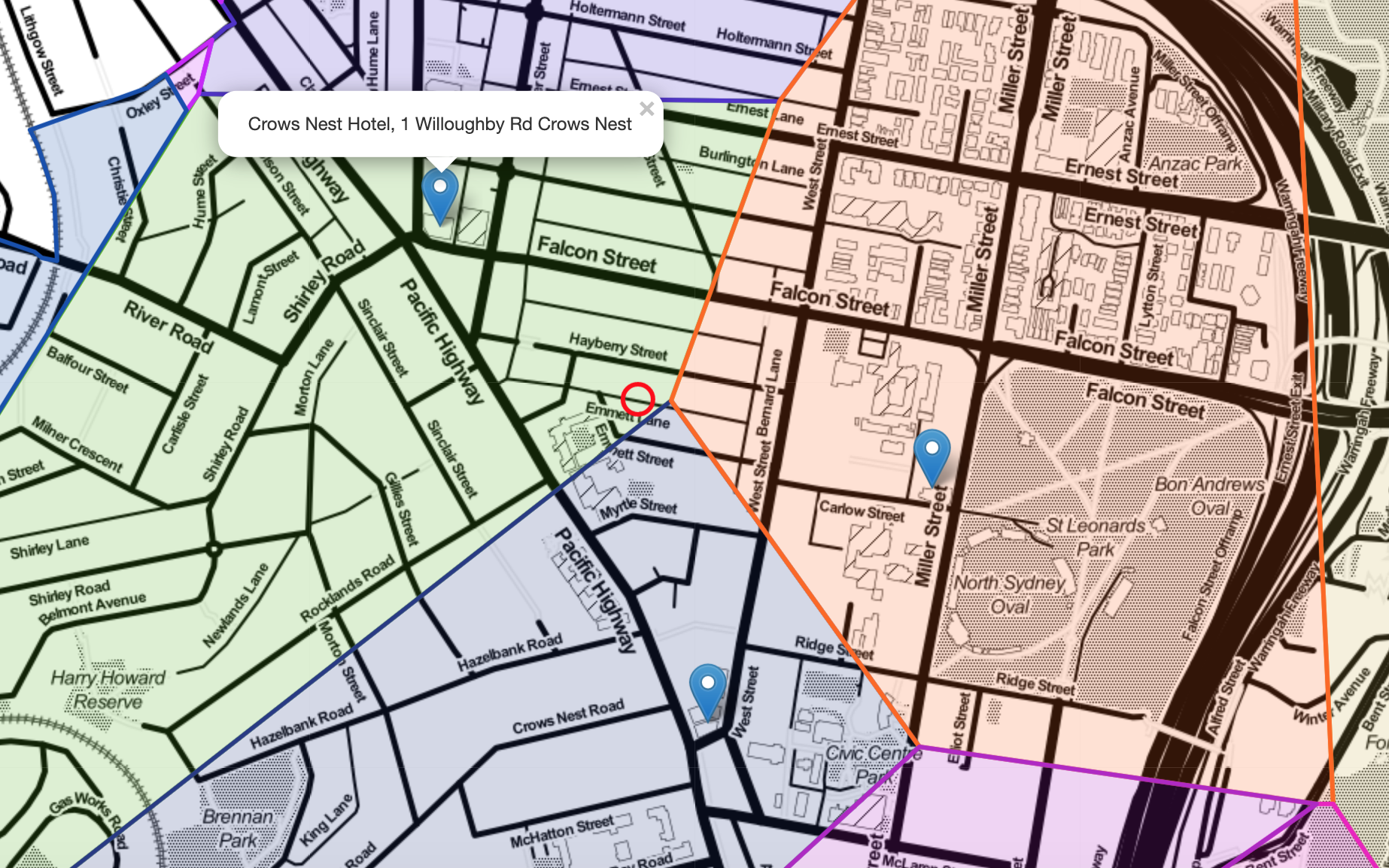
If a location is at the edges of multiple Voronoi regions, this can illustrate equidistant options from that point.
You’ve probably seen how, given an address, online real estate listings and Google Maps generate nearby lists of infrastructure, entertainment and shops. The ranked list on these services, while useful, might not convey just how similarly near the options are. In this image we can see that a house at Emmet Lane, Crows Nest would be equidistant from three different family friendly pubs.
2. Heritage hotels on tourist trails
One of the features of the licences data is a commencement date for the liquor licence at the property. While there’s no doubt that the commencement date alone in these regulatory files won’t capture the whole story, this data feature does present a history and heritage perspective that we can map.
Data steps:
- The commencement date can be used to order the licences chronologically. I proceeded to then cut down the data to the 150 oldest still-operating licences, which range from 1906–1947.
- For the 150 oldest licences in the state, a decade data category was derived.
- These were plotted across New South Wales, with colour-coding corresponding to decade:
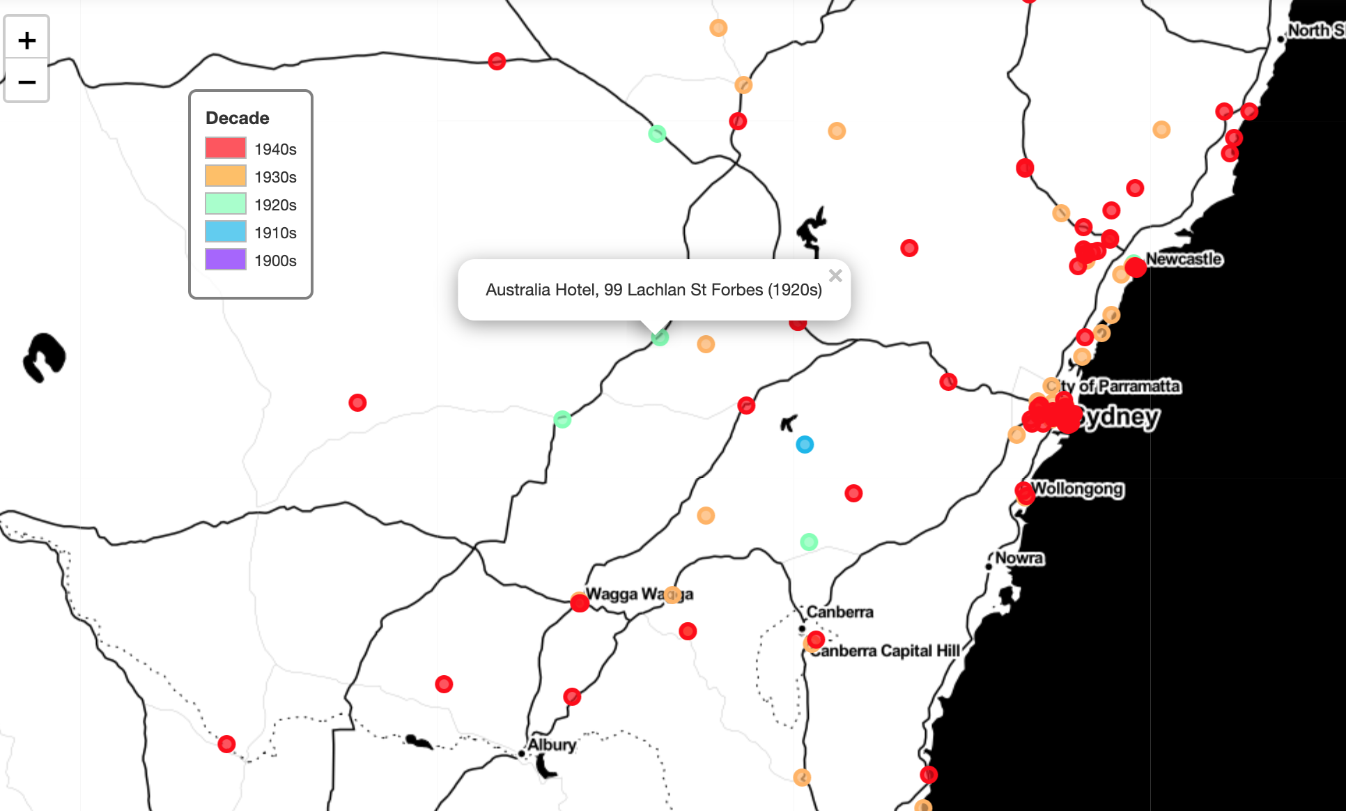
Travelling to the regions? The Newell Highway might be a ‘scenic route’ option if you’re interested in 1920s hotels.
The 1900s licence isn’t visible in the above view because of the dense clump of Sydney points—it’s the Glasgow Arms in Ultimo (which, by the way, has undergone obvious physical updates, a reminder that the year alone doesn’t guarantee a heritage building). It’s the purple point in this view of the map:
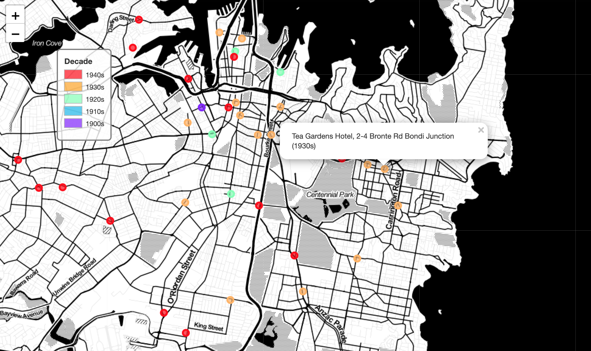
Licence commencement year: an inspiring starting point that shows how an administrative detail can be adapted towards a cultural or historical insight.
3. Business planning: new locations for small bars
Finally, I’d like to highlight the predecessor article to this post where I first made use of the Data.NSW liquor licences data. The concept was to investigate which inner Sydney suburbs might be appropriate locations for new small bars. You can check out the original article here. That post covers the data process in detail.
In particular, I wanted to note one of the map visualisations, which went beyond the standard point markers we’ve seen throughout this post:
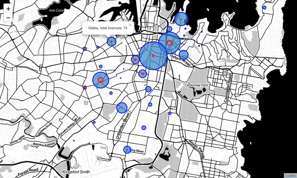
Here, the blue circles are positioned at the centre of suburb boundaries and their size is dictated by the total number of liquor licences in the suburb. Meanwhile, the red ring was scaled according to the number of small bar licences in the suburb. The selected suburb in this view is Glebe, however, over to the southwest of this point, you’ll note the small blue circle where the red circle is a similar size to the blue circle its imposed onto. This indicates that for the suburb of Enmore, small bars represent a particularly high relative proportion of all issued licences.
When we compare the Enmore and Newtown circles with the Sydney suburb (i.e., the CBD) circles, the proportion of licences that are small bars (red ring vs. blue circle) could be used as an indicator of the suburbs’ comparative character.
Wrapping up
I hope this blog has been a worthwhile introduction to open data and how data sets that might not seem cultural can still be analysed for insight that might support cultural decisions.
The open data landscape in Australia is an evolving one — I’ll be keeping an eye out for any new data sources across the various platforms. When something fruitful or interesting arrives I’ll be sure to dive in via a future post.


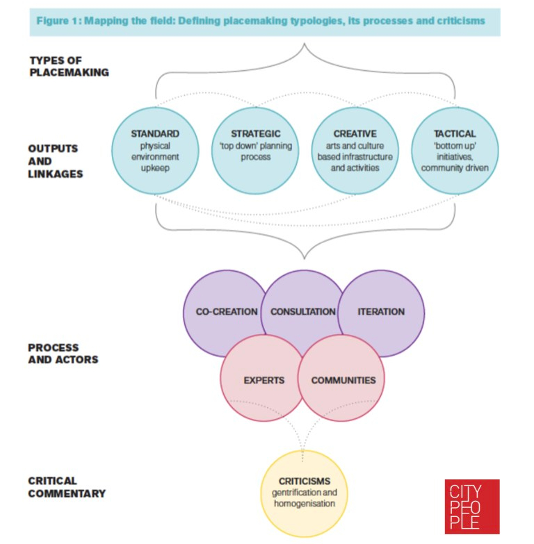 Happily, Lew is the first to admit that these are not neat and tidy compartments and that there is a lot of bleed between different areas. So as a team, we agreed to adopt his framework as the most useful way to think about creative placemaking in relation to other placemaking practices. As I’ve mentioned, placemaking exists in a contested field and no doubt there will be dissent among practitioners about whether this is correct or not. But we believe Lew’s framework lends itself to the diversity of placemaking projects around the world.